Break the rules of Fashion.
Before they break you.
That’s the claim.
The claim REBELLE used to introduce its 360° campaign to the European market.
To coincide with the launch on 1 January 2018, a TV ad stages the brand message with its attention-grabbing statement. And there’s plenty to see:
The Case film.
THE TASK
Refine the appearance and create a campaign for rebelle.com, a platform for second-hand designer fashion. Big, loud, different, and oh-so relevant.
THE IDEa
REBELLE is high fashion, but different: second hand. And targets women who consciously and confidently use fashion to express themselves and not just teeter after trends. So the brand positioning should be consistently different, the brand awareness enhanced, and female customers gained.
THE SOLUTION
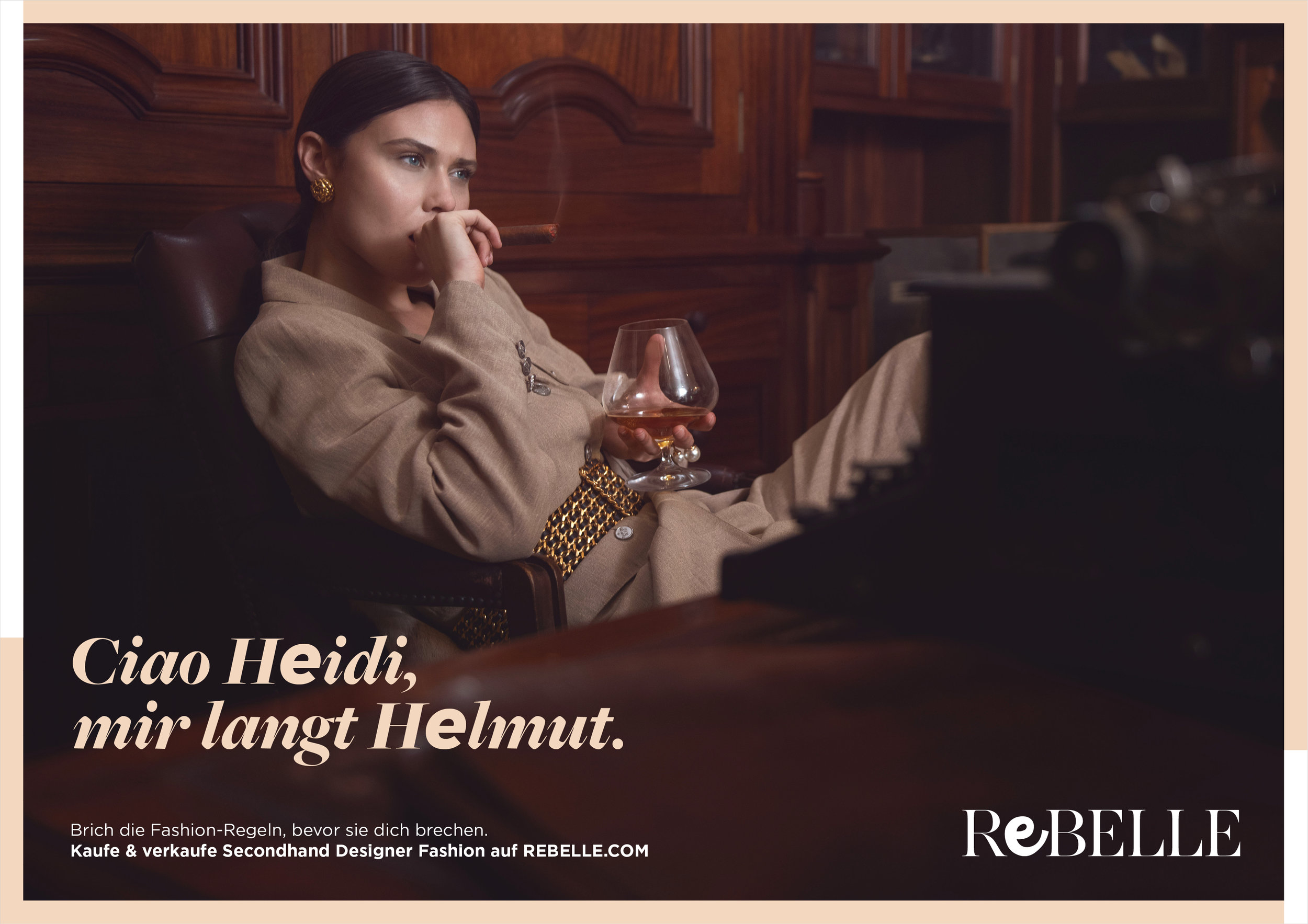
We break design rules, overhauling the logo and typography. In the campaign we show how much fun it is to break the rules of fashion, to interpret them for yourself and to rewrite them.
THE Content collection.
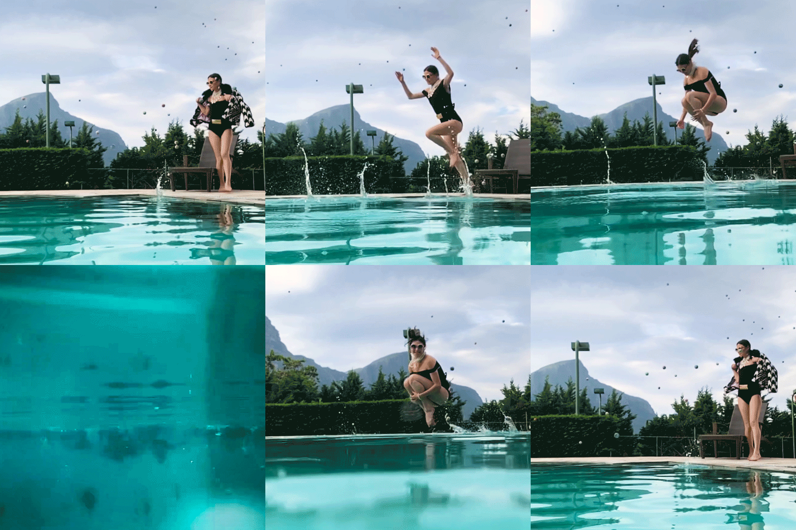
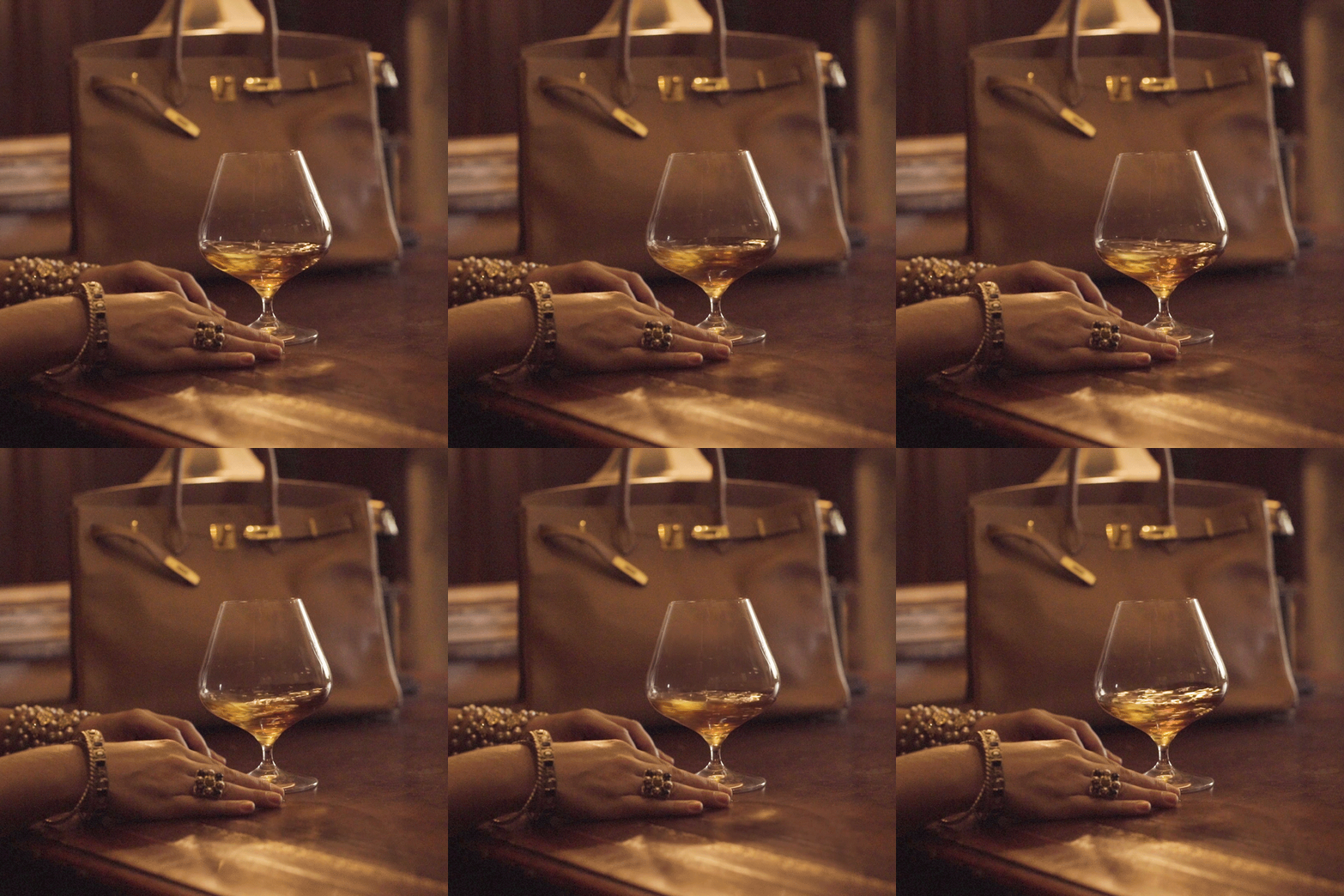
The collection of GIFs, loops, Boomerangs and even 3D photos conveys this strong stance across all digital channels, making the campaign even more tangible.
The MAIN Themes.


DIGITAL BANNER FORMATs
THE Design.
Wear everything, whatever the brands: Burberry check with Chloé dots, Moschino with Versace, high heels with camouflage, the season before last with pride. You turn the dogmas of fashion inside out – and you look awesome to boot. We add that to the visual appeal.
THE LOGO
Communication starts with the logo. So did we. In keeping with our campaign motto, “Break the rules before they break you”, we decided to break the rule: “Don’t touch the logo.” Again and again and again.
By breaking conceptual rules, we made the lettering unique, exciting, digital. We developed the first dynamic logo, which in itself is perfect for product communication. After all: it’s got precisely what’s available at rebelle.com.
The Typography
A rebellious use of CI lets the typography take more of a stand. Mixing the two corporate fonts, in their boldest versions and the same font size, results in striking headline lettering.
With the rebellious “e” we break the rules of standard-compliant, uniform typography, thus making a positive impression. One that’s satisfyingly out of the ordinary.
💥


